

iOS Health App
Introduction
This is a study case about the iOS Health App. It aims to propose feature improvements to increase the app's DAU. The app of today looks as shown in the illustration – it aggregates data from different apps & shows the overall summary to users.
Throughout the case I share my thought process including my product thinking, UX approach and UI skills in order to explore the current scenario and come up with my final solution.

Process Overview
Empathize
What: project goal
Why: meaning behind
Who: target users
Jobs:
- Market sizing
- Benchmarking
- Research, survey
and interviews
Define
- Problem statement based on user’s needs
- Main audience
- How to create unique value and why
- Biggest people problem
- Opportunities to address with solutions
Ideate
- All about brainstorming and coming up with ideas to solve the problem
- Quantity over quality of ideas
Prototype
- Paper prototype
- Low fidelity prototype
- High fidelity prototype
- User feedback
- Iteration
Test
- User testing
- Iteration
- Measuring success
- Next steps
- Final considerations
Market Sizing
Understanding the health apps industry
+300k
health apps available
$11Bi
market value expectation by 2025
+60%
of people have downloaded a health app
85%
of downloaded health apps are wellness related, and only 15% are medical related
Benchmarking
Understanding the best health apps and their main features
Example of apps analysed

Learnings from Benchmarking
Main learnings after studying different health apps:
Method/process
1. Researched best apps available
2. Made a selection to be analyzed
3. Learned about those apps
4. Downloaded same apps
5. Collected reviews and opinions
6. Compiled raw data into learnings
What I focused on
1. How they work
2. What are their best features
3. Which problem(s) they are solving
4. What makes them successful
5. Why users use them
What I learned
1. Lots of gamification strategies applied
2. Users consider them as “motivator buddies”
3. Apps solve real life problems
4. Have daily interactions with users
5. Features are easily customizable
6. Bring a real impact on user’s lives
7. Inputting data manually didn’t seem to be an issue
8. They offer special sections according to user’s needs
9. “Set goal” feature as one of the most liked features
10. Apps are quite adaptable according to user needs
iOS Health App
Understanding the product and its main features
Learnings
1. Purpose of app is to consolidate multiple health data into one place.
2. Provides a complete variety of healthy metrics to users.
3. Allows users to manage habits and improve their routine.
4. Incorporates data from third-party apps from the health industry.
5. Allows users to track various symptoms and learn about them over time.

What kind of people are into health apps?
85%
of health apps downloads are related to wellness
15%
of health apps downloads are related to medical
Choosing a type of user
So who are the people I am focusing on and why?
Because of the massive potential market, I will focus on Wellness users.
I assume a good slice of them are also iOS users and will want to use the iOS health app to incorporate the data of their wellness being apps downloaded.
Short-term value
By providing/improving a delightful experience within our product, our user engagement (% of people using it) can be high.
Long-term value
I also see a positive impact on customer loyalty and a potential increase in the Life Time Value (LTV) of our product - by increasing customer engagement I expect to have more loyal customers that will more likely to use the app for longer and recommend it to family and friends.
Identifying the users
Understanding our target audience
User Research
Understanding our target audience
So who are the people I am focusing on and why?
To deep dive further on these users, I did Desk Research to find out as much as I could, and in addition, I put together a short survey and asked my friends to answer for me.
My goal
Collect as much data as I could to potentially find out and define a specific type of users and their behaviours.
Main questions of survey
Do you use the iOS Health app? If yes, why? If no, why not?
If yes...
Why do you use it?
How and how often do you use it?
Do you use it in addition to other health apps? If so, which ones?
What are the things you like and dislike the most about the app?
. . .
Defining users to focus on
Learnings
1. Users would like to see daily news, quotes, and fresh information about topics of their preference.
2. Users would like app to be more participative in their daily routine, almost like a personal trainer.
3. Not enough personal recommendations and interactions.
4. Users would like to interact more with the app throughout the day, instead of only inputting data from time to time.
5. Users would like to see their progress and improvement on whatever the activity they have added in the app.
6. Users would be willing to pay an extra fee for premium features as long as it provides a unique service.
7. After a while, users find the app boring as it is currently.
8. Users would like to know what new features the app is preparing to launch in the near future.
9. Users say that current features are not exciting enough.
Personas & Archetypes
To build customer empathy, I gathered all the information around this segment of people and came about our primary user type:
Meet Maya...
Hi, I'm Maya!
“I care a lot about my health, so I want to understand how my body is doing regularly.”
“Everyday I try to find time to do some kind of exercise, so I continue improving my fitness level”.
“I love eating healthy but I’m afraid I don’t do it properly because it is hard to control all my meals and have a plan to follow”.
- She likes all kinds of fitness activities.
- She wants to continue improving her eating habits.
- She loves running and has run a marathon.

Customer's Journey
An exploration of Maya's journey during a day in her life

Use cases & user stories

Maya's
job to be done
1. Decide what activities she will do
2. Plan her day and where she will go
3. Get to the places she needs to go
4. Work, work, work
5. Do some kind of activity
6. Enjoy her day
7. Keep herself healthy

Maya's
pain points
1. She likes working out but she loses motivation every time she starts an activity and end up quitting.
2. She doesn’t know exactly how to make a proper plan for her daily meals.
3. She is able to eat properly for a few days but after a while she gets lost on managing what she should be eating.
4. She doesn’t have time enough during her day to keep up with all the wellness accounts she follows on social media.
Identifying Opportunities
So, what can I build to fulfill our customer needs?
Based on this research so far, I understood that ...
Identifying People Problems
Maya has a hard time keeping herself on track about her fitness activities and eating habits, and after a while she loses her motivation.
People Problem # 1
Maya has a busy schedule and doesn’t have time to keep up with wellness updates, news and tips on her social media apps (Instagram, Twitter and Youtube)
or any other means.
People Problem # 2
The Problem
“Current version of app isn’t exciting enough for users to continuously using it. Main features are boring and confusing.”
Exploring design solutions
Product Goal
How might we create an unique experience to wellness people who uses the
iOS Health App?
My Assumption
My assumption is that the idea of redesigning the app is to bring more interaction between user and app, make the user feel more engaged, and increase the frequency and excitement that the user has on the app.
By improving its experience, my assumption is that users will start using the app more often and will check it a few times per day. The new experience is aimed to make users spend more time on the app by providing them with more engaging and user centric features.
Brainstorming
Process
During brainstorming, I focused on quantity over quality (of ideas). I thought about many different ideas for the app such as: short videos, animation and stories about user data, a goal setting feature, motivational quotes and messages, a feature to share the user profile with friends, and so on.
Conclusion
For the sake of this exercise, I am going to focus on two specific solutions because they have more to do with our business goal, they solve the customer problem and we can have a better impact on DAU. If I am successful to solve this problem, I expect people to lean on the app more to manage their wellness activities and consequently spend more time on the app.
Exploring design solutions
Solution 1: Me
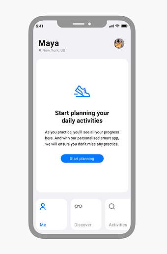
“Me” is the new version of the “Summary” page in the app. The new interface is focused on helping the user to keep motivated and on top of their activities every day. The user now is able to check not only the past but also the future of their wellness plans.
Solution 2: Discover
“Discover” is a brand new page in the app. It is focused on providing the user with unique and relevant articles about their favourite topics, such as: CrossFit, Yoga, Health Food and many others.
So let's start from the beginning...
Paper Prototype | Me
User flows

Initial Prototypes

Low Fidelity Prototype | Me


High Fidelity Prototype | Me
Identification
Small personalization. The goal is to make the user feel that the app is all about them
Navigation
Main actions that user can do in the app.
Current Status
Information to help the user to start engaging with the app


Learnings
From the original interface, the feedback from users were: there was too much information, too much text, data was confusing, it was easy to get lost and there was also irrelevant info.
After creating the first prototype, I presented again to a few users and the feedback was: very clean interface, interesting data points, engaging, but too much text, and bottom navigation was confusing and it was taking too much space on the screen.
Iterations | Me

Version 2
Original
Version 1
More learnings
Users also said that they would like to see their record of their activities and that although information was interesting, there was too much text.


Paper Prototype | Discover
User Flows

Initial Prototypes

Low Fidelity Prototype | Discover

High Fidelity Prototype | Discover
Standard articles
Standard articles were previously in the “Summary” page, below the user data summary. Now, I created a specific page for those articles with many other articles from different topics, such as: CrossFit, Yoga, Health Food, Running, etc.


Learnings
From the original interface, the feedback from users were: there were only two random articles available, and that they were hidden where they were.
After creating the first prototype, I presented again to a few users and the feedback was: decision to remove it from the “Summary” and place in a specific page makes total sense.
Iterations | Discover

Version 2
Original
Version 1
Final Considerations
The usability tests on the high fidelity mockups helped me learn more about where I need to improve and if I am in a comfortable position to consider this an MVP.
Impact
Measuring success
Let's recap our goal...
Our project goal is to create a product that provides welness users with an exciting and engaging experience when using the iOS Health App.
We will know when we achieve that when we see:
Primary metric
- Increase in the app's DAU
Secondary metrics
- Increase in the amount of time spent on the app
- Increase in the number of activities created
Complementary metrics
- # app downloads
Thank you!
