


Introduction
Cabify is a Spanish ridesharing company. It provides vehicles for hire via its smartphone mobile app. Vehicles are driven by self-employed service providers. Operating in Latin America, Spain, and Portugal, the company offers two services, one for businesses and another for individuals.
Project Goal
In 2016, the company wanted to expand their business into the delivery services. The pilot market was São Paulo, Brazil. They needed a landing page to acquire riders to their platform before launching it officially to the public. As a freelancer, I had the oppotunity to design it. Besides receiving the briefing with the necessary specifications for the job, I was able to work with one stakeholder from their team in Brazil. She was a key account manager in charge of building the riders platform.
Measuring Success
During the alignment phase, when discussing with Cabify what should be the criteria to make sure the page was successful, my proposal was:
Business Perspective:
The ultimate metric should be adoption rate, In other words, the number of subscriptions from riders and partners the page would bring, since the main CTA of the landing page should be aimed for this audience to subscribe to the platform.

Empathizing
Although I wish to have had more available resources to empathizing with the project, I had to create it based on the few data that was provided, and on the tight deadline.
With that in mind, I applied the following techniques in order to generate further insights:
Desk Research
Gathered as much data as I could about the target audience (riders from São Paulo). What moves them, what troubles them? Are there friction for them? What are their actual problems? Is there a solution they really need?
User Interviews
Cabify didn't provide me with the ideal resource but fortunately a cousin of mine is a rider. So, I called him and asked if he could help me by answering a few questions. It turned out it was the most helpful.

Initial Findings
1. What other players are out there
2. How their bussines work (inculding their platforms)
3. What are their competitive advantage
4. How to sign up for their programs
5. What things they are not doing so well
Defining
After immerging myself into the project and understanding my customer deeper, now it is time to focus on defining the problem statement I need to solve. This was built on my observations collected about my users during the “Empathizing” phase. Based on that, I decided to use the four Ws techinique (who, what, where and why) since I had limited information.
Problem (s)
Who is experiencing this problem?
The focus, while trying to solve the problem.
Assumption (s)

Potential riders who need to sign up and find out more about the program.
What is the problem?
The main pain point that stands in the user’s way.
Acquire as many riders as possible for the platform by making them to sign up.
Where is the problem happening?
The context around the problem (physical, mental or digital).
Directly digitally, and consequently, indirectly physically. No riders, no delivery.
Why is it important?
The reason users will get substancial value out of that problem being solved.
Once riders have signed up, they will be enable to start delivering and making extra money.
Ideating
The challenge here was to be creative but still having to follow the requirements and standards of the brand.
To brainstorm on this project, I started taking a look at other companies’ landing pages (different industries), plus Cabify own website(s), then reflected on it before moving forward.
Benchmark
Companies analyzed: Uber Eats, Loggi, Glovo, Rappi, Revolut, Quinto Andar, and Nubank.

After getting some inspiration on how these brands have been addressing similar needs, it was time to write down some ideas and organize them:
Card Sorting
After writing down all the ideas and elements I could think of, I organized them into different blocks. Those blocks would later shape the structure of the landing page and help me with the elements I should place on each block. It was an exercise that I combined both the given requirements from Cabify, plus ideas that I thought it could work.

Once I was finished with sorting out the structure for the landing page, I was finally able to start sketching.
Sketching
I created multiple versions in order to generate enough ideas before moving to prototyping. During this stage, I wanted to make sure all the requirements were met, structure was well balanced and main actions were prioritized.

Prototyping
As a landing page should be a webpage that prompts the visitors to take certain action, the main action for this landing page is for visitors to sign up to the Cabify Express Riders program. However, for that, they first need to have a clear understanding about how the program works and what are the benefits of signing up. With that in mind, along with all the work I have put together in the preveious steps, this landing page is divided in 6 sessions:
1. Header & Above the Fold elements
The most important item in this part of the landing page is the CTA (left hand side of the page). The short copy above it explains that if the rider has either a motobike or a bicycle, he is ready to start making extra income. On the right hand side, a photo illustrating sharing food.
CTA: Sign Up
Header: Brand standard

Text: What product provides to customers (what it is about)
Image: Meal

2. How to sign up
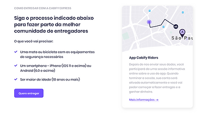
As the user scrolls down, the first session to be displayed is about what is necessary for users to sign up and become a Cabify Express rider. The left part describes what the rider will need, such as: a motobike or bicycle, a smartphone and be +18 years old. On the left side, there is a short explanation of what happens after sending the application, including a link to find out more about it.
Text: How it works, what customers will need in order to sign up
Copy: About Cabify Riders app

CTA: Sign up
3. Why joining Cabify Express
The next session describes the main reasons why riders should join Cabify Express. It basically mentions the advantages of becoming a rider, such as: guarateed payment, flexible schedule and guaranteed demand. This session has no CTA since all the advantages are already described and there is no need for user to take any action from there.
Image: Illustrative
Text: Brief explanation about the advantages of joining

Text: Competitive advantage/benefits

4. FAQ
The FAQ session was required and the main questions were already given. My work here was to come up with a structure where the user could read more about the questions but without being transferred to another page. The only thing allowed to be linked to another page was the session on the right side that talks about all the contact channels that are available, should users have any further question.
Image: Illustrative
Text: Brief explanation about the advantages of joining


Text: Competitive advantage/benefits
5. Social Proof
To give even more credibility to the project, since it was in an early stage, I’ve decided to add a Social Proof session to it. The idea was to share a few quotes from existing riders. I focused on the simplicity of it by having only a picture of the riders along with their quotes. I also added their names and the neighborhoods where they work in São Paulo.
Image: Illustrative

Text: Competitive advantage/benefits

6. Footer
The footer itself had to follow the standard structure of the brand, including all the general links and the download app options. What I added was the two CTAs, for both riders and partners. They were placed on the bottom of the page to make sure they were easy to find once again, since the CTA of this landing page was the top priority purpose of it. As the brand also requested a CTA for partners, I placed it here because it wasn’t a priority but a “nice to have” item.
CTA 1: Sign up as riders
CTA 2: Sign up as partners


Footer: Brand standart
Final Prototype

